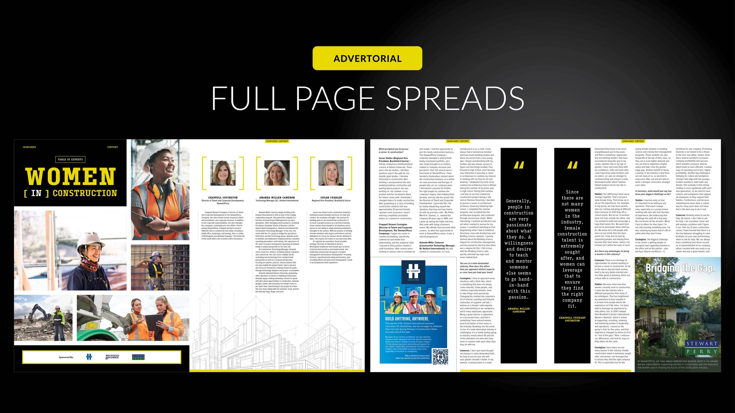
Visibility and diversity are two terms that came to mind before executing these spreads. The conversation was centered around female executives in construction work.
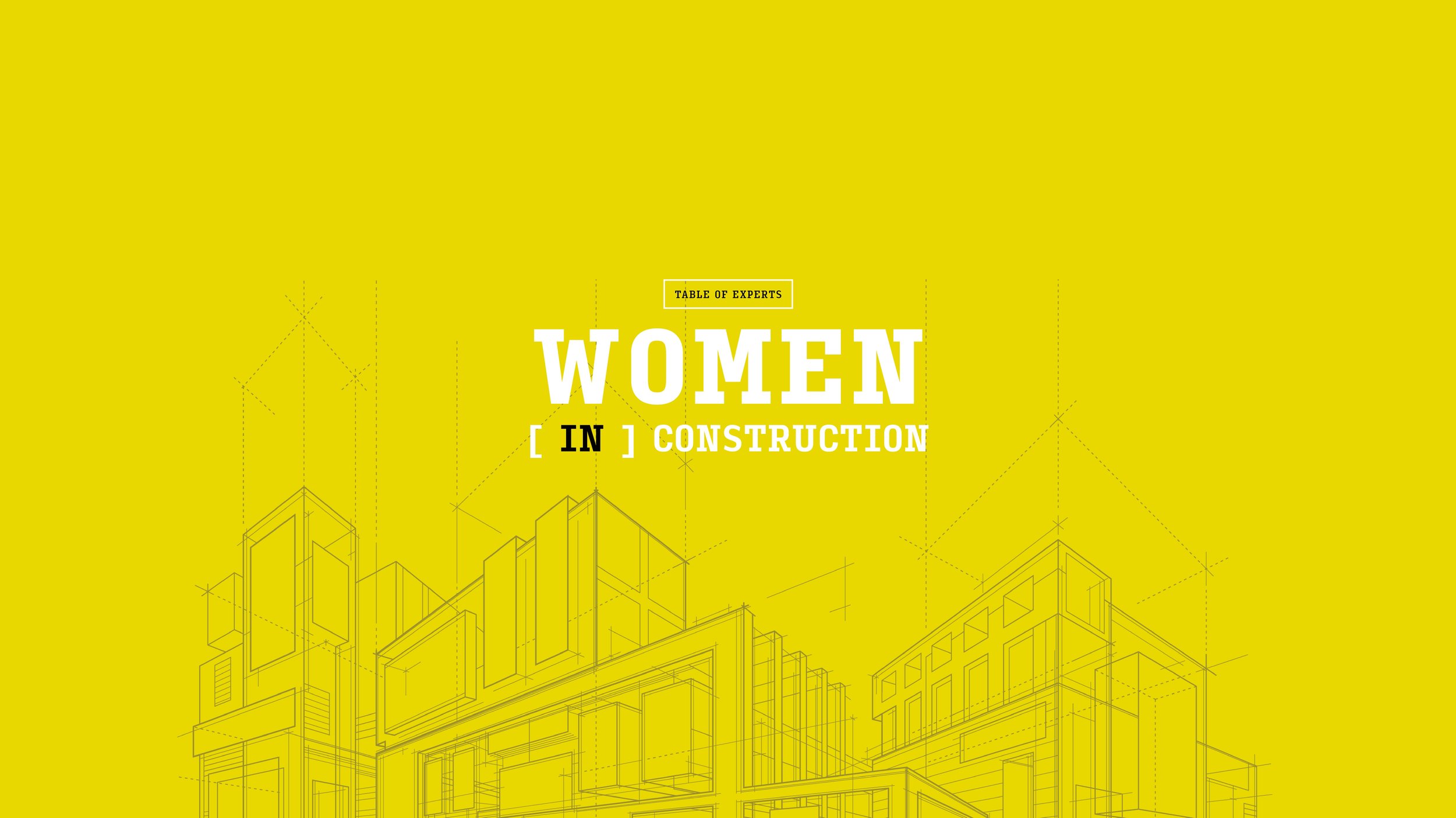
I made sure to include imagery of women from different cultural backgrounds for the cover spread. In addition to the blueprint-like pencil work illustration, I chose to utilize a narrow slab serif typeface.
This particular font, along with the pencil sketches, suggests the beginning stages or “first steps” in creating something massive.


